A brief introduction to editing your webpages

These sites use a What You See Is What You Get (WYSIWYG) rich text editor that mimics some of the features found in programs such as Office Word, Pages, etc.

This manual is provided to help you navigate through the site and to edit pages using the editor.

**Please note. We do not recommend copying and pasting directly from another rich text editor into the editor.

Go to https://labs.dgsom.ucla.edu/edit

**You can change your password after logging in.

Once logged in, you will remain logged in until you either logout or you close your browser.

To logout go to https://labs.dgsom.ucla.edu/edit/logout

Once logged in, navigate to the page you would like to edit:


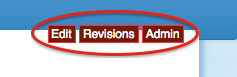
To edit a page, navigate to that page and look for the links labeled “Edit” and “Revisions.”

edit.png

1. After logging in, navigate to the page that you would like to edit.

2. If the page is editable, then you should see a link about 1/3rd of the page down labeled "Edit". Click on this button.

edit.png

3. This will open the editor. Please note that the section and description fields are usually empty.

example of editing with ckeditor

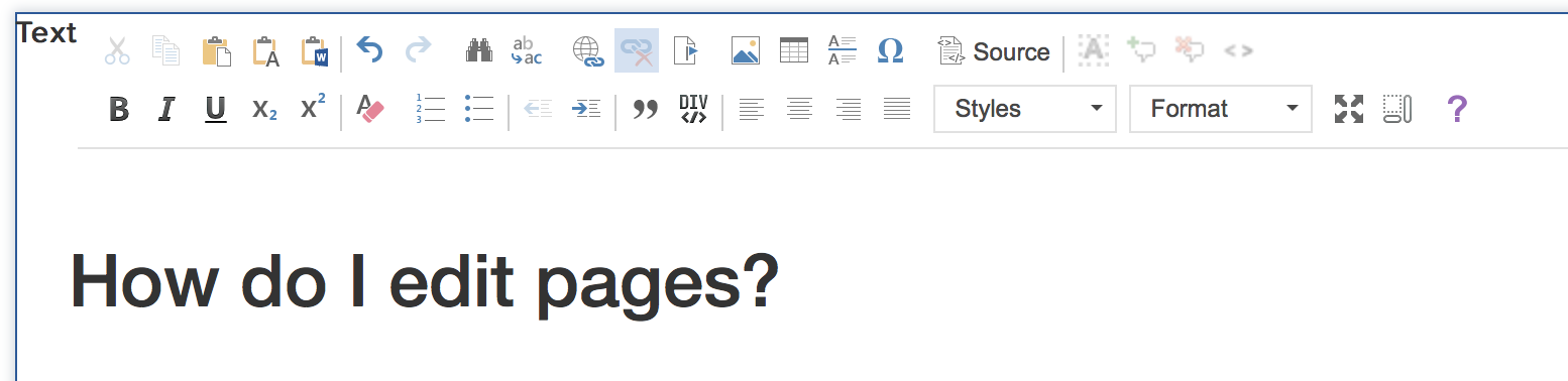
4. Edit the page using the editor. *For advanced users, you can edit the html directly by clicking on


5. We highly recommend creating your document in the editor and not in another word processor. If you do create the document in another word processor then please convert the document to a .txt file and do a copy from that document. You will lose all formatting and will need to reformat the document using the editor. This is why we recommend editing the document in the editor first. Please see "Why doesn't my page look like it did in Word (or another rich text editor)?" below to see what happens to when copying from a word document.


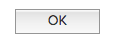
6. You must click on the button labeled "OK" before your changes will take effect.

Please visit the ckeditor quick reference page. This page will reference more buttons than what comes standard with your editor.

Many functions in CKEditor have their equivalent keyboard shortcuts. This is one of the reasons why working with the editor is simple and efficient.

The list below contains available keyboard shortcuts grouped by problem areas.

Working with a Document

  • Esc – closes a CKEditor dialog window, drop-down list, or context menu. Also moves from the context menu submenu to the parent option.
  • Enter – selects a CKEditor function from the toolbar, drop-down list, or context menu. Equivalent to the OK button in a dialog window.
  • Shift+F10, Menu/Application key – opens the element's context menu.

Navigation

  • Home – jumps to the beginning of the line.
  • Ctrl+Home – jumps to the beginning of the document.
  • End – jumps to the end of the line.
  • Ctrl+End – jumps to the end of the document.
  • PgDn – scrolls down the document, approximately by the length of the editing area.
  • PgUp – scrolls up the document, approximately by the length of the editing area.

Writing

  • Enter (Return) – ends a paragraph and starts a new one.
  • Shift+Enter – adds a line break.
  • Backspace, Del – deletes a character.
  • Ctrl+Backspace, Ctrl+Del – deletes a word.

Undo and Redo

  • Ctrl+Z – performs the undo operation.
  • Ctrl+Y – performs the redo operation.

Cut, Copy and Paste

  • Ctrl+X, Shift+Del – cuts a text fragment to clipboard.
  • Ctrl+C – copies a text fragment to clipboard.
  • Ctrl+V, Shift+Insert – pastes a text fragment from clipboard.

Text Selection

  • Ctrl+A – selects all document contents.
  • Shift+Arrow – selects a text fragment by letters.
  • Ctrl+Shift+Arrow – selects a text fragment by words.
  • Shift+Home – selects a text fragment from the cursor to the beginning of the line.
  • Shift+End – selects a text fragment from the cursor to the end of the line.
  • Ctrl+Shift+Home – selects a text fragment from the cursor to the beginning of the document.
  • Ctrl+Shift+End – selects a text fragment from the cursor to the end of the document.
  • Shift+PgDn – selects a text fragment of approximately the length of the editing area starting from the cursor and going down.
  • Shift+PgUp – selects a text fragment of approximately the length of the editing area starting from the cursor and going up.

Text Styling

  • Ctrl+B – applies bold formatting to a text fragment.
  • Ctrl+I – applies italics formatting to a text fragment.
  • Ctrl+U – applies underline formatting to a text fragment.

Rich Text

  • Ctrl+L – opens the Link dialog window.

Accessibility

  • Alt+0 – opens Help.
  • Alt+- (minus) – collapses and restores the toolbar.
  • Alt+F10 – enters the toolbar or the tab list of the currently open dialog window.
  • Alt+F11 – enters the elements path.
  • Tab – moves to the next toolbar button group, context menu suboption, elements path element, dialog window element, or dialog window tab while in the tab list.
  • Right Arrow – moves to the next toolbar button within the group, context menu suboption, elements path element, dialog window element, or dialog window tab while in the tab list.
  • Tab or Down Arrow – moves to the next drop-down list or context menu option.
  • Shift+Tab – moves to the previous toolbar button group, context menu parent option, elements path element, dialog window element, or dialog window tab while in the tab list.
  • Left Arrow – moves to the previous toolbar button within the group, context menu parent option, elements path element, dialog window element, or dialog window tab while in the tab list.
  • Shift+Tab or Up Arrow – moves to the previous drop-down list or context menu option.
  • Space or Enter – activates a toolbar button, a context menu option, a drop-down list option, an elements path element, or a dialog window tab once selected. Also enters a context menu submenu, if it is available.

  1. Navigate to your file storage instance.
  2. Use the user interface to add your file or image to file storage.

Adding an image

  1. Upload your image to your file storage instance.
  2. Save the url to the image.
  3. Go to the page you want to add your image to and click to edit it.
  4. Move the cursor in the editor to the place you want to add your image.
  5. Click on the image icon image add preview icon
  6. Copy the image url into the provided spot.
  7. Click ok.

Adding a document

  1. Upload your image to your file storage instance.
  2. Save the url to the document.
  3. Go to the page you want to add your document to and click to edit it.
  4. Highlight the text you want to
  5. Click on the link icon link add preview icon
  6. Copy the document url into the provide spot
  7. Click ok.

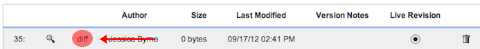
Click on the button that says "Revisions"

This page will list all the versions that were published. Your most recent changes will be listed at the top.

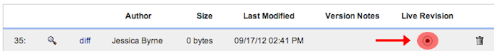
Use the radial selection under the column labeled "Live Revision" to select the version of the page that was still working.

Contact pbabin@mednet.ucla.edu for additional assistance updating the page.

1. After submitting an edit, you can view the previous versions of a page by clicking on the button/link labeled “Revisions.”

edit.png

2. All previously published versions of the page will be displayed on this page.

revision.png

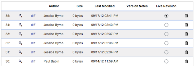
3. The magnifying glass shows what the page will look like if that particular version is selected to be live.

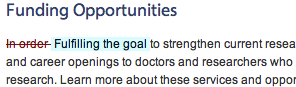
4. Clicking on the link labeled “diff” will show the differences between the version displayed and the one previous. A red strike-through represents a deletion. A blue-highlight represents additions.

revisiondiff.png

fulldiff.png

5. The column labeled “Live Revision” shows which version is currently being displayed on the website. You can revert to a previous revision by selecting the radial of any previous version.

liverevis.gif

6. The trashcan allows you to delete any version submitted. We highly recommend that you do not use this feature! By deleting a version, the version is no longer available for a user to return to.

You can get more information about CKEditor by clicking the purple "?" button.

You can contact Paul Babin either through email at pbabin@mednet.ucla.edu or by calling (310) 206-4444.

Bootstrap is an open source toolkit for developing responsive, mobile-first projects with HTML, CSS, and JS. It allows developers and editors to quickly prototype, develop and edit sites with a common framework. You can learn more about it by going to http://getbootstrap.com.

Bootstrap was born from two developers at Twitter to promote consistency across internal tools. It contains HTML- and CSS-based design templates for typography, forms, buttons, navigation and other interface components, as well as optional JavaScript extensions. Unlike many web frameworks, it concerns itself with front-end development only.

The short answer is yes. The longer answer is that we've added components to our editor that attempts to make editing bootstrap components easier.

The site you are working on includes an editor called CKEditor. It is a powerful What-You-See-Is-What-You-Get (WISIWYG) editor. You are already familiar with a popular WIYSIWYG suite called Office. Microsoft Word, Power Point and Outlook are all examples of extremely sophisticated software programs that have become integrated in our lives. We've added an Outlook skin to CKEditor to help you with editing your pages.

CKEditor is great at making quick edits. You might find a typo on a page that you need to correct, that is a quick edit. Need to add a new paragraph to a page. Copy and paste straight out of word and your task is done. You might need to move a picture from the left side of a page to the right side . . . this is where the WYSIWYG editor becomes what I see is not what I am getting!!!!!!

Don't get frustrated. We are here to help when you come across structural edits that might seem overwhelming. However, we encourage you to learn more about HTML development and you will soon find yourself a guru. I'm willing to bet that when you first learned Word it didn't come naturally! I can remember tapping the "space bar" five times to indent a paragraph when I first started. It wasn't until someone pointed out that I could hit the 'tab' key to auto indent that I learned that Office had some tricks up its sleeves. A course in high school taught me that I could change the margin sized, dictate where I wanted my tab stops and that I could do ordered and unordered lists.

The rest of this guide/questions will provide a brief overview of some of the concepts of your website and editing tricks that will have you being a guru in no time.

Many web pages are based on a grid-view, which means that the page is divided into columns. Using a grid-view is helpful when designing web pages as it makes it easier to place elements on the page.

When I first started developing in '98 everything needed to be put into tables. I don't want to go into how much of a headache this was. You defined heights - widths - nested tables within tables... now you just put things into rows and columns!

Grid systems are used for creating page layouts through a series of rows and columns that house your content. Here's how the Bootstrap grid system works:

  • Rows must be placed within a .container (fixed-width) or .container-fluid (full-width) for proper alignment and padding.
  • Use rows to create horizontal groups of columns.
  • Content should be placed within columns, and only columns may be immediate children of rows.
  • Predefined grid classes like .row and .col-xs-4 are available for quickly making grid layouts. Less mixins can also be used for more semantic layouts.
  • Columns create gutters (gaps between column content) via padding. That padding is offset in rows for the first and last column via negative margin on .rows.
  • The negative margin is why the examples below are outdented. It's so that content within grid columns is lined up with non-grid content.
  • Grid columns are created by specifying the number of twelve available columns you wish to span. For example, three equal columns would use three .col-xs-4.
  • If more than 12 columns are placed within a single row, each group of extra columns will, as one unit, wrap onto a new line.
  • Grid classes apply to devices with screen widths greater than or equal to the breakpoint sizes, and override grid classes targeted at smaller devices. Therefore, e.g. applying any .col-md-* class to an element will not only affect its styling on medium devices but also on large devices if a .col-lg-* class is not present.


Vist the bootstrap website for a more detailed explanation of the grid system.

Here is a visual of the grid system.

span 1 span 1 span 1 span 1 span 1 span 1 span 1 span 1 span 1 span 1 span 1 span 1
span 4 span 4 span 4
span 4 span 8
span 6 span 6
span 12

This table summarizes how the Bootstrap grid system works across multiple devices.

  Extra small devices
Phones (<768px)
Small devices
Tablets (>=768px)
Medium devices
Desktops (>=992px)
Large devices
Desktops (>=1200px)
Grid behaviour Horizontal at all times Collapsed to start, horizontal above breakpoints Collapsed to start, horizontal above breakpoints Collapsed to start, horizontal above breakpoints
Container width None (auto) 750px 970px 1170px
Class prefix .col-xs- .col-sm- .col-md- .col-lg-
Number of columns 12 12 12 12
Column width Auto ~62px ~81px ~97px
Gutter width 30px (15px on each side of a column) 30px (15px on each side of a column) 30px (15px on each side of a column) 30px (15px on each side of a column)
Nestable Yes Yes Yes Yes
Offsets Yes Yes Yes Yes
Column ordering Yes Yes Yes Yes

The above example and table can be found at w3schools.

There are two ways that you can manipulate bootstrap elements on your site.

  1. Preferred Method (greater control): You can edit the source code directly.
    The Bootstrap documentation will provide a number of examples that you can copy and paste directly into your source code. W3schols also provides an excellent tutorial on all things bootstrap that you can attempt to try.
  2. You can use premade functions.

The functions include:

  1. inserting bootstrap labels
  2. add icons
  3. create easy buttons
  4. add an alert
  5. add rows and columns
  6. aditional functions to modify rows and columns

"Bootstrap label" allows the user to create a label by altering its title, color, and style.

  1. Click on this button
  2. This should open an editor called "Insert Bootstrap label".
  3. The first row of buttons shows the different color options for the label. When you select your desired color, the color label will be highlighted in light blue.
  4. Change the title of the label by replacing "New" with the desired label title.
  5. Modify the label's appearance of the edges by selecting one of the three options in Corners.
    • "None" creates sharp edges on the label.
    • "Radius" creates slight rounded edges on the label.
    • "Rounded" creates completely rounded edges on the label.
  6. You can view a preview of your label in Preview.
  7. Once you're satisfied with your label, click "OK".
  8. If, at any time, you would no longer like to create a label select, "Cancel" or press the "x" button on the top right corner.

You can also add a label using the source code.

There are six different colors:

  1. Default = gray and white
  2. Primary = Dark Blue
  3. Info = Light Blue
  4. Success = Green
  5. Warning = Orange
  6. Danger = Red

Wrap what you want to be in a label with with a span.

<span class="label label-primary">This is what I want to wrap in a label.</span>

This is what you will get.
This is what I want to wrap in a label

If you want to change the color from blue to red, change the second class.

<span class="label label-danger">This is what I want to wrap in a label.</span>

This is what you will get.
This is what I want to wrap in a label

"Bootstrap icon" allows the user to insert an icon and alter its size and color.

  1. Click on this button
  2. This should open an editor called "Insert Bootstrap icon".
  3. In order to search for your desired icon, scroll down or search the icon in the search bar located on the top left corner.
  4. In order to select an icon, simply click on the desired icon with your cursor. Once an icon is selected it will be highlighted in light blue.
  5. Adjust the size of the icons by inputting desired size or by pressing the ‘-‘ (decrease size) or ‘+’ (increase size) buttons.
  6. Adjust the color of the icons by clicking on the "Color" section and a color table will open. You can adjust the color of the icons by pressing on the desired color.
  7. If you would like to keep the style of each icon the same throughout your page, DO NOT select "Add to style" for "Size" and "Color"
  8. DO NOT select "Insert as bitmap".
  9. Once you are satisfied with your icon, click "OK".
  10. If, at any time, you would no longer like to create an icon, select "Cancel" or press the "x" button on the top right corner.


You can also add icons using the source code.

Bootstrap has over 250 icons built into it. The icons are graciously provided by Jan Kovarik. More information can be found at Glyphicons.com. You can find a full list of available icons here.

The basic structure for any icon is as follows:

<span class="glypicon my-selected-glyphicon"></span>

Replace my-selected-glyphicon in the line above to display the icon of your choice and then add this code to the source code.

Pro tip: You can add icons to buttons. Also do not add anything in the span. This is one of the rare occassions where it is ok to have an empty tag.

"Bootstrap Button" allows the user to create a button by altering its title, color, size, style, and by adding a link.

  1. Click on this button.
  2. This should open an editor called "Bootstrap Button".
  3. The first row of buttons shows the different color options for the button. When you select your desired color, the color button will be highlighted in light blue.
  4. The second row of buttons shows the different size options for the button. When you select your desired size, the size button will be highlighted in light blue.
  5. If you would like to enable the button, make sure "Enable" is selected.
  6. If you would like to change the width of the button to go across the screen, make sure to select "Width 100%".
  7. DO NOT select "input" or "button".
  8. Link a link to the button by entering the link to "Link".
  9. Change the title of the button by entering desired title into "Text".
  10. You can view a preview of your button on "Preview".
  11. Once you are satisfied with your icon, click "OK".
  12. If, at any time, you would no longer like to create an icon, select "Cancel" or press the "x" button at the top right corner.


"Bootstrap alert" provides four alert options from which the user selects and inserts.

  1. Click on this button.
  2. Select your desired alert.


"Bootstrap row at cursor" allows that user to create rows and columns by selecting the column type and the amount of rows and columns.

  1. Click this button
  2. This should open up options.
  3. Select the desired column type.
  4. Select the desired amount of columns or rows.
  5. If you would like to see the blocks, refer to the instructions in the "Show blocks" function.


"Show blocks" allows the user to see the rows and columns that were created.

  1. Click this button.
  2. This should automatically show the blocks.
  3. The red lines separate the rows and the blue lines separate the columns.
  4. When blocks are created, additional space is also created in between each row.


Rows and columns can be moved (up, down, right, or left) by using the functions "Move row up", "Move row down", "Move column right", "Move column left".

  1. Select the row or column you would like to move, either up, down, right, or left.
  2. Click this button to:
    • move your selected row up.
    • move your selected row down.
    • move your selected row to the right.
    • move your selected row to the left.


The "Maximize" function allows the user to view a larger range of their editing screen and content.

  1. Click this button.
  2. This should expand the editing screen


HTML allows you to create a list with automatic numbering.

Problem

Publications are usually separated by year. However, the count for each list restarts at 1 if you just create a new list for each year.

Example

Year 1
  1. Publication 1
  2. Publication 2
  3. Publication 3
  4. Publication 4
  5. Publication 5
Year 2
  1. Publication 6
  2. Publication 7
  3. Publication 8
  4. Publication 9
  5. Publication 10

Sample Code

<h5>Year 1</h5>

<ol>
<li>Publication 1</li>
<li>Publication 2</li>
<li>Publication 3</li>
<li>Publication 4</li>
<li>Publication 5</li>
</ol>

<h5>Year 2</h5>

<ol>
<li>Publication 6</li>
<li>Publication 7</li>
<li>Publication 8</li>
<li>Publication 9</li>
<li>Publication 10</li>
</ol>

To create an ordered list that includes multiple lists with a running count (i.e. title, new grouping, break in the page> - usually you will append each ordered list with a start attribute

However, this means that you will need to modify and manually keep track of the start numbers whenever you add a new list item or publication

Solution

We have a means of allowing you to creat a running tally of publications on a page with multiple lists: however, you will have to edit the source code

Example

Year 1
  1. Publication 1
  2. Publication 2
  3. Publication 3
  4. Publication 4
  5. Publication 5
Year 2
  1. Publication 6
  2. Publication 7
  3. Publication 8
  4. Publication 9
  5. Publication 10

  1. add <div class = "pubCounter"> before the list and </div> after the list, surrounding the entire list
  2. after this closing page, add a

Sample Code

<div class = "pubCounter">

<h5>Year 1</h5>
<ol>
<li>Publication 1</li>
<li>Publication 2</li>
<li>Publication 3</li>
<li>Publication 4</li>
<li>Publication 5</li>
</ol>
<h5>Year 2</h5>
<ol><
<li>Publication 6</li>
<li>Publication 7</li>
<li>Publication 8</li>
<li>Publication 9</li>
<li>Publication 10</li>
</ol>

</div>

Adding a Parallax Background Image

Parallax scrolling: The background content (i.e., an image) is moved at a different speed than the foreground content while scrolling

Default

<div class="parallax-bg"> &nbsp; </div>

The parallax scrolling effect is made possible by using the class parallax-bg .
The default parallax has the height of 150px with DGSOM image positioned approximately centered.
The position varies by browser calculation and it is recommended that user sets a position.

Other default images are:

DGSOM

Geffen 1

Geffen 2

Geffen 3

Changing the Image

<div class="parallax-bg" data-background="path to url on system"> &nbsp; </div>

To change the image, the image must be uploaded in the file-storage. Upload the image to /labname/files/images.
The path needs to be relative. Copy and paste the image URL to the class data-background (e.g., data-background="/labname/files/images/imagename.jpg").


Positioning the Image

<div class="parallax-bg" data-position="0 250px"> &nbsp; </div>

To position the image, use data-position="xpx ypx" . Imagine the image is placed on an xy-plane, but with reversed y-axis (negative on top, positive on bottom)
(tip: if you read CSS documentation on background position, only pixel calculations work)
Replace x and y with numbers. Since the image is approximately centered by default, x should always be 0.
To raise the image, use negative y in pixels (e.g., data-position="0 -250px").
To lower the image, use positive y in pixels (e.g., data-position="0 250px" as shown above).
If the image is positioned beyond its bounds, gray background will show


Adjusting the Height of the Background

<div class="parallax-bg" data-size="300px"> &nbsp; </div>

By default, the height of the image is 150px. The user can override by specifying the data-size .
To display larger area of the image, increase the pixels. Too display smaller area of the image, decrease the pixels.

With all classes combined,

<div class="parallax-bg" data-background="/resources/images/geffen3.jpg" data-position="0 250px" data-size="300px"> &nbsp; </div>

If your parallax scrolling is longer than the image that you uploaded, resulting the gray background to show, add the property data-background-repeat in the div. This will repeat your background image.


Using Parallax as a Header

To set a parallax header, add both parallax-bg and parallax-header in the same div. Without the parallax-header as a class, a white space bar will appear under the navigation


Inserting Heading in the Parallax

Adding the class container centers the h1 (heading).

Replace container with container-fluid for a full width container with padding to the right and the left

Due to the parallax effect, all content is flushed left with the browser window if no styles are added. The use needs to define containers for each element of the site.


Styling Heading in the Parallax

Any CSS styles can be added inline for any element including alignment, background colors, background images, drop-shadows, etc.
Please refer to W3Schools for CSS attributes.
(tip: do not use this example in your code as it may break the design. We recommend using bootstrap classes to center-text, pull to the right or left-- text-center , text-left , text-right .


Notes

Use this area to add tips and notes for editing.