2. Installation considerations.
2.2 Software Location and Installation.
4. Loading and pre-processing data.
5. Analyzing your data by differential expression.
5.3 Integrative differential expression analysis.
6. Analyzing your data using co-expression networks.
7.1. Gene ontology functional annotation.
7.2. Transcription regulator annotation.
7.3. Biocarta and KEGG pathway annotation.
The purpose of the iArrayAnalyzer software (iArray for short) is to make integrative microarray analysis easy. You can find more information about this type of analysis in References (Section 10). In short, to compensate for the high noise levels in microarray data, you can (and should) analyze multiple datasets at a time, and in many cases this dramatically enhances the signal-to-noise ratio.
This user guide will help you to quickly and easily analyze multiple microarray datasets together, and narrow your results from an unintelligible pool of hundreds of potential genes to only the most significant, recurring signals. Throughout this guide, we?ll use [square braces] for stuff that?s on your computer screen.
As a final note before the main event, know that as a team we are highly open to suggestions/bug reports/praise, (the last one especially,) so feel free to write to us at iarray@cmb.usc.edu, with whatever you need to get off your chest.
For the current release (1.1.13), the minimum recommended specs are:
PC running the Windows 2000 or XP operating system (Vista is probably fine)
� 1GHz or better processor
� 1GB of RAM or more
� 1GB of available hard disk space (400MB are absolutely required)
Run the program with a lesser computer at your own risk! In fact, for many operations, more RAM is highly recommended. Since many operations require sufficient memory due to the size of the datasets involved.
You may download and install the latest release of iArray at http://zhoulab.usc.edu/iArrayAnalyzer.htm. After filling in the registration form and accepting the license agreement, you will receive an email containing login information and a HTTP link to download the iArray software. This software is provided free of charge to the academic research community for non-commercial and educational purposes only. For information on commercial use or use by a commercial or for-profit organization, please contact Professor Xianghong Jasmine Zhou (http://zhoulab.usc.edu/people.htm).
After downloading the iArray installer, iArray.exe, to a local directory, launch the setup program by double clicking on the downloaded file. Follow the step-by-step instructions of the setup program (Figure. 1). After clicking the ?Finish? button at the last step of the installation, the iArrayAnalyzer icon will be displayed on the desktop. You can launch the iArray program by double clicking the icon, or select [All Programs/iArrayAnalyzer/ iArrayAnalyzer] from the Windows Start menu.
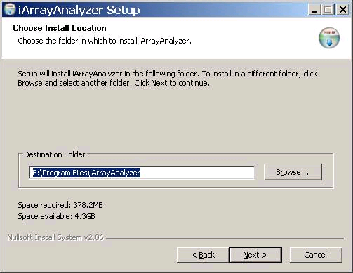
Figure 1: iArrayAnalyzer installation screen. Provide the location of the folder where the software will be installed
Note: First, it should be noted that any new installation of iArrayAnalyzer requires the removal of the old version. Hence you may find it necessary to back up your files before installing the new version. Second, if you have already registered, please use the login and password provided to you at the time of installation. In case you do not remember the password, please provide your email address and click on the Forgot Password button. Your password will be emailed to you.
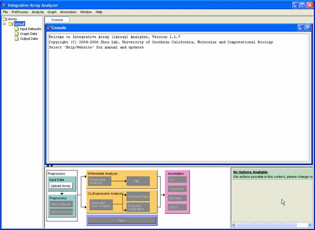
Figure 2: iArrayAnalyzer main screen
Figure 2 shows the main screen of iArray before any action has been taken. The layout consists of a menu bar at the top, a file listing [navigation tree] to the left, a console which shows various log messages and also displays any results that are generated. Perhaps the most important part of the iArray user interface (UI) is the flowchart. This rather nifty contraption, which can be minimized by clicking on the arrows just above the sitemap, performs the following two functions: a) shows a global outline of the kinds of analysis available in iArray as a whole; and b) shows which options are available in the current context by graying out unavailable actions. You may also observe a small panel to the right of the flow chart. This panel displays the options available to you at any stage of the analysis. You may move the mouse over the options for more tips. It may also be noted that to display information about any of the files in the navigation tree, simply bring the mouse over the relevant file and its details will be displayed in a small box.
Before you analyze anything, you may find it useful to know that you can start several independent projects in iArray, which are organized like folders in Windows. All data is stored in [C:\Program Files\iArrayAnalyzer\work] unless you change the installation folder of iArray manually. In that case, the folders would be stored under [<Installation folder of iArray>\work].
There are a number of ways through which you can load your data: you can click on [File>Add Data Files] in the main menu; you can click [Upload data] in the flowchart (the preferred method, because we like the flowchart); and finally, for the keyboard types, you can press Shift+A.
In all these cases, the [Select the Data files for Analysis] dialog (Figure 3) appears. Here you can input microarray data files in one of the following formats: (i) delimited table, in which columns are biological samples and rows are either NCBI GeneIDs, Affymetrix ProbeSet IDs, Unigene IDs or Gene symbols; (ii) NCBI GDS format; (iii) NCBI GSE format. The last two are especially useful if you download data from NCBI?s public microarray database, GEO (http://www.ncbi.nlm.nih.gov/geo/). A note for would-be NCBI-format uploaders: if the GDS or GSE file uses a different gene identifier to Affymetrix ProbeSet ID, you need to place the corresponding GPL file in the same directory as the dataset. Due to unavailability of standard formats for the GSE datasets, all datasets may not load successfully. For more information on NCBI file formats, see this page: http://www.ncbi.nlm.nih.gov/projects/geo/info/overview.html.
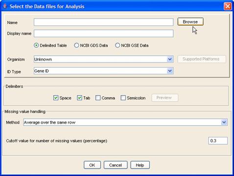
Figure 3: Adding data files
Begin by selecting files either by typing the full path or by clicking the [Browse] button. When browsing, you can select multiple files by using Shift and Ctrl as in standard Windows applications. Select the appropriate file format and (optionally) a name for the imported dataset. Select the organism and the ID type of the primary identifier in the dataset. To see a list of all the platforms supported by iArray, please select the Probe Set ID option and then click on the [Supported Platforms] button. (Do remember to set back the correct identifier after seeing the supported platforms). Make sure that all files belong to the same species and file format, because you cannot mix and match different ones in a single upload operation. You must use the data upload dialog multiple times to be able to use multiple formats and/or species.
The input files of expression data matrices should be delimited text files with space, tab, comma, or semicolon as separators. Figure 2 illustrates the typical format of an input microarray data file. The first column consists of the row identifiers, and the first row consists of the column identifiers. The row identifiers can be Probe Set IDs, Unigene IDs, NCBI GeneIDs or Gene Symbols. The header row starts with ?#columnname? followed by the name for each data column (Figure 4, marked in green). The numerical values in the yellow block are the gene expression measurements. Figure 4 shows an input file with Probeset ID as row identifiers.
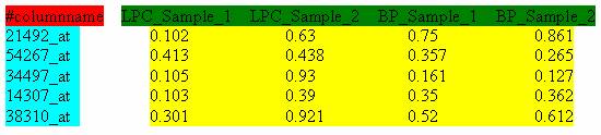
Figure 4: Format of input files. In this case, the row identifiers are Affymetrix Probe Set IDs
Figure 5 shows an input file with UniGene ID as row identifiers. UniGene is a system for automatically partitioning GenBank sequences into a non-redundant set of gene-oriented clusters (http://www.ncbi.nlm.nih.gov/entrez/query.fcgi?db=unigene).

Figure 5: Input file with Unigene ID as row identifier.
.
Figure 6 shows an input file with NCBI GeneIDs as row identifies. The NCBI GeneID identifies each record in NCBI's Gene database.
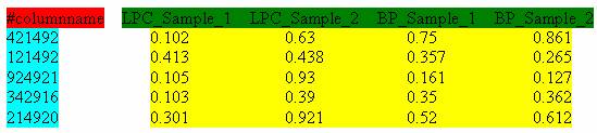
Figure 6: Input file with NCBI GeneID as row identifier.
It is assumed that each row has the same number of data points. If there is missing data, an ?NA? or ?NULL? should appear at the corresponding position in the matrix.
If you so desire, you can change the way missing values are handled in the [Missing value handling] box. You can change (i) how many missing values are acceptable in a gene expression profile before the gene will be discarded and, (ii) for the remaining genes, which method to use to estimate missing values. The choices are: averaging over the same gene (each missing value for a gene?s expression is converted to the average of the known values) using the [Average over the same row] option, in which case, the cutoff for the number of missing values should be specified as a value between 0 and 1 indicating the percentage of missing values; and k-nearest neighbors impute, a.k.a. KNNI, using the [Average over K neighbors] option in which the missing value is estimated as a weighted average of the values from the k most similar gene expression profiles in that dataset. For the second option, again the cutoff for the number of missing values should be specified in addition to the maximum neighbors to consider for calculating the missing value.
Datasets are loaded into the [Input Datasets/Raw Data] folder in the navigation tree. In our running example we will add 4 files - dhanasekaranSM.txt, luoJ.txt, singhD.txt and welshJB.txt. The sample files are present under the [<iArray installation folder>/data/prostate_cancer_human_geneid] folder. Choose the species as [Homo sapiens] and the ID type as [Gene ID]. Leave all the other values as default. Click on the [OK] button. A status bar will be displayed indicating the progress. The files will be visible as shown in Figure 7.
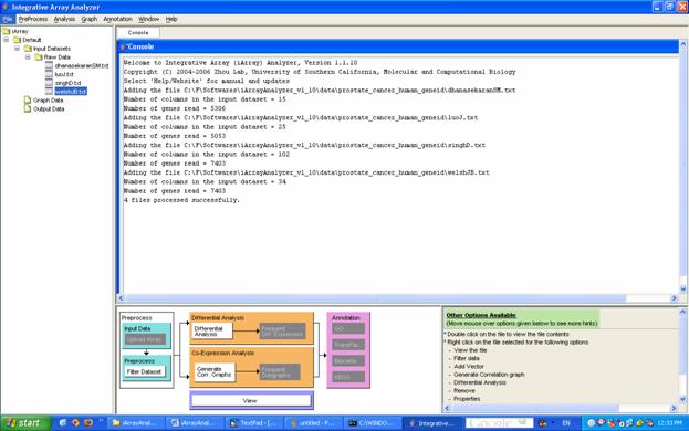
Figure 7: Files added are visible in the navigation tree on the left hand side of your screen.
After all your datasets have been loaded, you should filter the data to improve performance. Filtering removes ?boring? genes from the gene list in order to reduce the search space and make the rest of the analysis easier (or, in some cases, feasible). You can declare genes boring according to two criteria, which are not mutually exclusive: (i) gene variation across samples: if a gene just sits there at the same expression level for all your samples, chances are you will not be very interested in this gene; (ii) expression level: even if a gene has high variance, if its expression level is very low, it?s probable that this variance is simply due to signal noise.
To filter the data, select the datasets that you would like to filter in the navigation tree, then click either (i) [Filter datasets] in the flowchart (again, the preferred option); or (ii) [Preprocess>>Filter data] under the main menu. You may also select the files to be filtered and right click to bring up the pop up menu and then choose the [Filter Data] option. The [Choose filter options] dialog opens, with variance filtering as the default. Notice that you can decide how stringent to be with your filtering, both within individual datasets (how high does the variance have to be?) and between datasets (if a gene is ?interesting? in just one dataset, we keep its expression values in all datasets). Filtered datasets appear under [Input Datasets/Filtered Data] in the navigation tree.
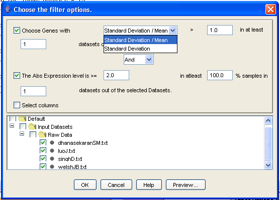
Figure 8: Filtering the data
Finally, for cross-species comparisons, orthologs have to be linked between datasets. iArray determines orthology by using the NCBI Homologene database (so if you have any objections about the linking results, write to us at iarray [at] cmb.usc.edu with your suggestion for better linking methods!) Linking can be performed automatically, seamlessly and invisibly at later stages by the software, but you may also link the datasets manually beforehand by selecting the appropriate datasets and selecting [Link datasets] from the [PreProcess] menu option. The linked data files will be placed under [Input Datasets/Linked Data]. You may also be interested in the values from certain specific samples and hence, you may check the [Select Columns] option. A dialog will open where you will be allowed to select the columns of interest for each file.
For our running example, Ctrl-select all four files in the [Navigation tree], under [/Default/Input Data/Raw Data], and click on [Filter data] in the flowchart. The [Filter data] dialog box appears. Change the minimum value of [Standard Deviation/Mean] to 1.0, and check the [Abs expression level] tick box, leaving the default values on. Then click on the [OK] button. The files will be added under [iArray/Default/Input Datasets/Filtered Data] in the [Navigation Tree].
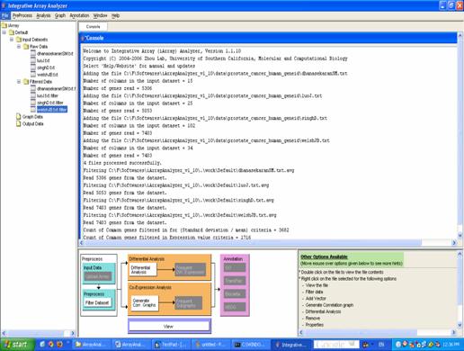
Figure 9: Filtered files added under [iArray/Default/Input Datasets/Filtered Data]
iArray has a built-in project management feature. Using this feature is optional (the "Default" project is loaded when the software is launched for the first time), but can be useful if multiple analyses are to be carried out in parallel, or if you want to keep all your previous analyses in the program. Note that when the program exits, the workspace is cleared, but the navigation panel remains intact, so you can quit the program without fear of losing your data. Currently, a project export function has not been implemented (so you have to complete a project on a single computer), but one is planned for future releases. To create a project, click on [File/New Project]. A prompt asking for a project name will appear. Enter a name and click [OK].
One last thing: sometimes, we are not interested in genes but in phenotypes. For example, you may want to include in your analysis the age of the samples, the time for a time-course experiment, the dosage of a drug, etc. For all these things, there is the [Add vector] action: right-click on a dataset in the navigation tree and select [Add vector]. You can click on the Add Column button to add more than one vector. The data vector will be assigned a negative number as identification so that they do not conflict with existing gene ids. iArray will then treat this phenotype as just another gene in the dataset.
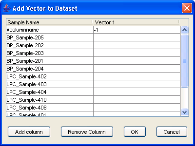
Figure 10: Add Vector Dialog
Whew! Hopefully after all that, you have a set of nice, clean datasets just waiting to be mined for knowledge, for the good of mankind, and, let?s face it, for a little personal glory. Read on for the low-down on the analysis modules.
Differential expression analysis (DEA) is the oldest and most common use of microarray data. The basic principle is that some of your samples are cases and some are controls, and you want to check whether a gene?s expression is up- or down-regulated in the cases. This is usually taken to mean that this gene is involved in whatever process it is you are studying. Of course, due to the noisy nature of microarray data, and the fact that we are testing thousands of genes at once, this type of result is usually littered with many genes that are only detected because of noise or some trivial biological reason.
With iArray, we hope to help you cut through the noise by allowing you to integrate your study with similar or related studies.
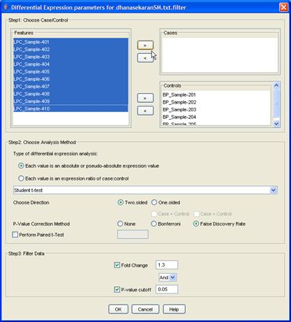
Figure 11: Differential Expression Analysis Dialog
Begin by selecting the datasets that you would like to use for DEA. You can select multiple datasets in the navigation tree by holding down the Ctrl key. Then click the [Differential Analysis] button in the flowchart. You will see a dialog titled [Differential expression parameters for <filename>], where <filename> is one of the files you selected for analysis. Your choices here will determine the outcome of the analysis, so tread carefully! (Don?t worry, it?s not too hard.)
Firstly, there are two main kinds of differential analysis, determined by the kind of data you have:
1. Absolute or pseudo-absolute expression values: each data entry in some way represents the expression level of a gene in a given sample. This is the case in oligonucleotide arrays, in which each value represents the absolute abundance of a gene?s mRNA, and in cDNA microarrays in which the competing cDNA for a sample comes from a pool of all the samples, or from some control sample.
2. Log-ratio values: each data entry is the log of the ratio of gene expression in a case sample to that in a control sample. This is the case in cDNA microarrays in which we competitively hybridize case and control mRNA to a cDNA spot. (Although this type of array has become less and less popular due to the dramatic price drop of oligo arrays, we included it in iArray since our effort is in part to facilitate the reuse of the vast amount of microarray data already available.)
In the first case, we separate samples into cases and controls, and a Students t-test or Mann-Whitney test is performed to test whether the values in one group are different to those in the other, for each gene. In the second, we select which samples we want to analyze and then a t-test is performed to determine whether the log-ratio is significantly different from 0. Select the desired option and the test to be used (Student t-test or Mann-Whitney test). Also choose whether the p-Value calculation should be one sided or two sided. If the option chosen is one sided, then you will need to specify if the cases are greater than controls or vice versa.
It is important to note that this analysis performs a hypothesis test for each gene in a dataset. Therefore, it is recommended that you use a multiple-testing correction: Bonferroni and False Discovery Rate correction methods are included.
As a final step before the analysis, you can filter the results to return only the most significant. You can specify a minimum fold-change and a maximum p-value (or q-value, as may be the case).
When you are done with the options, press [OK] at the bottom of the dialog box, and repeat this for each dataset that you are analyzing. A progress bar appears and, when the analysis is finished, the results are placed in the [Output Data/Diff Expression Data] folder in the navigation tree. One file will appear for each dataset. You can double-click on each file to see a list of differentially expressed genes in that dataset, and further, you can then double-click on any gene to see a bar-chart of the expression of that gene in that dataset as shown in Figure 12.
For the running example, you will need to complete the dialog for all four of your datasets. Starting with the first dataset [dhansekaranSM.txt.filter]: select all the samples labeled [BP] (Benign Prostate) and move them to the [Controls] box by clicking on the appropriate [>] button. Then select all the remaining, [LPC] (Localized Prostate Cancer) samples and move them to the [Cases] box the same way. Leave all the other options as their default values and click [OK]. Repeat this for the other three datasets. (Note: In the singhD dataset, [BP] is replaced by [normal] and [LPC] by [tumor]. When you click [OK] for the last dataset, a little progress meter will appear. When the analysis is done, three files will appear in the [Navigation tree] under [Output data/Diff Expression Data]. Each of these is a list of differentially expressed genes for that dataset. You can check out individual dataset results by double-clicking on the file. The table indicates the gene ID, gene symbol, pValue(or qValue if FDR is used), fold change, regulation and the gene information. Double click on any of the rows in the table for the bar chart to be displayed.
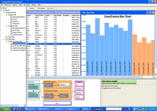
Figure 12: Result of differential expression analysis and viewing of case/control chart when clicking on a row in the result.
Until now, the analysis has only occurred on individual datasets in turn. Now iArray?s advantage over other software makes its mark. To integrate the results of DEA, select multiple DEA result files from the navigation tree and click on the [Frequent Diff. Expressed] button in the flowchart(or right click and select the [Frequent Item Mining] option). FIM stands for Frequent Itemset Mining, which is an algorithm first developed in the context of market analysis. You see, a straightforward integration of DEA results would simply look for genes which are frequently differentially expressed. FIM goes one step further, by finding sets of genes which are frequently differentially expressed together. Therefore, FIM results give you not only which genes are frequently differentially expressed, but also which genes among these are likely to be working together and also perhaps which datasets are most related to one another, and which are different.
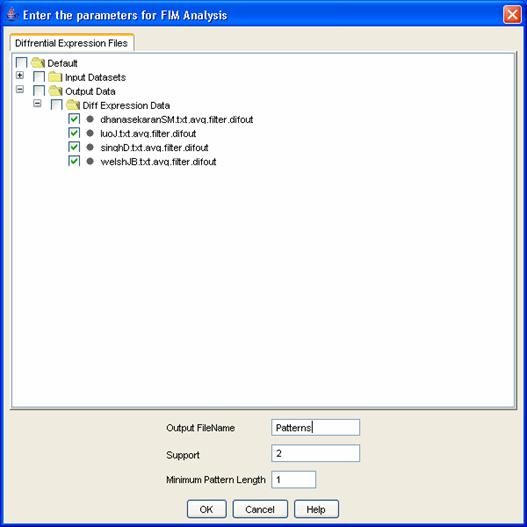
Figure 13: FIM Dialog
Once you have selected FIM, the [FIM] dialog box appears. Here, you can name your analysis to find it later easily, and you can also specify just how frequent ?Frequent? is to you, that is, the minimum number of datasets in which you would expect to find the reported gene sets. Finally, you can specify a minimum size for the reported gene sets. Click [OK] to let iArray do its magic. The result will appear in the navigation tree under [Output Data/FIM Data]. You can double-click on it to view it (or select the file and click on [View] in the flowchart). This will show a list of sets of genes, and for each set, the support (the number of datasets in which the genes are differentially expressed), and the support vector (which of the included datasets showed differential expression in those genes). You can double click on any gene set to display a list of all the genes in the set, and then double-click on any gene to see bar charts of the gene?s expression in each of the datasets in its support (Figure 14).
For the running example, select all four files and click on Frequent Item Mining in the flowchart. The FIM dialog appears. Enter ?Patterns? as the name for the FIM result file, leave the remaining values as default and click on the [OK] button. The table has the following columns ? Item Set #, number of genes, the gene set, support( the number of datasets in which the gene set is found) , the presence or absence of the gene set in the file and the list of gene IDs. Click on any one of the rows and the list of genes in that pattern will be displayed. Click on any of the genes in the list and a bar chart indicating the case control values will be displayed.
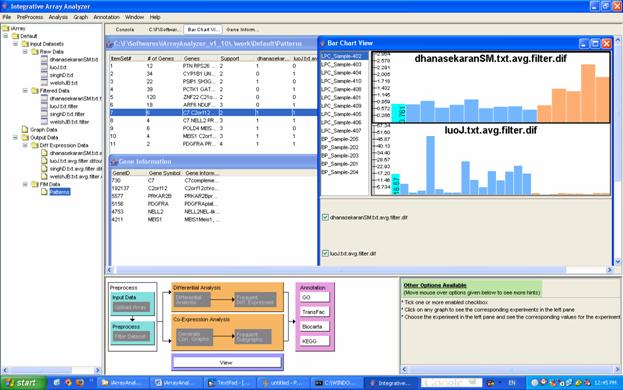
Figure 14: Frequent Item Mining results
These gene lists can be your end product with iArray but you may also want to try out iArray?s annotation modules, which can try to extract more information out of these gene sets. But before we cover that let?s look at that parallel branch of the flowchart, Co-expression Analysis. (You can skip ahead to section 7: Annotation.)
Another popular way to analyze microarray datasets is co-expression analysis. Here, we build a network of genes in which two genes are connected if their expression is correlated across many samples. The idea is that if the expression of two genes is tightly correlated, then they probably have common/similar/synergistic function. Extend that concept to a whole genome?s worth of genes, and you get a large network that can be analyzed by the many existing network algorithms.
To generate networks from datasets, select the datasets you want in the navigation tree and then click on the [Generate Corr. Graphs] button in the flowchart or alternatively, right click on the input files of your choice and then select [Generate Correlation Graph] from the popup menu. The dialog in Figure 15 will be displayed. The cutoff criterion to make an edge between two genes can be either a raw correlation value, a p-value, or a False Discovery Rate value. Here the p-value and FDR are based on the null hypothesis that the expression values of the two genes are independent.
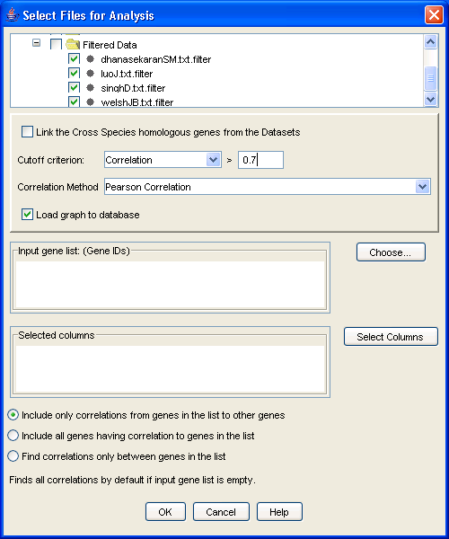
Figure 15: Generating Correlation Graphs
If you have a gene or several genes of interest in mind, you can list them in the [Input gene list] box. These needs to be input as a space separated list of NCBI GeneIDs, but if you don?t know them, don?t despair: click on the [Choose] button and the conversion table to Gene Symbols appears. Here you may choose the genes of interest and click [OK] which will populate the [Input Gene List]. There are four options available to generate the correlation graph:
You can either build a localized graph, focusing on genes of interest, or you can build the entire graph by leaving the gene list blank by choosing one of the above options. For the latter option, prepare yourself for a substantial wait. Two types of correlation estimation methods are employed in iArray, each being user-selectable. The first is the Pearson?s correlation coefficient, with the numerical value ranging from -1 to +1. +1 indicates a perfect linear relationship between these two expression profiles, while -1 indicates the expression profiles between them are completely negatively correlated. The second method is called Jackknife correlation, which is a leave-one-out Pearson correlation coefficient. First, one column of the gene expression vector is crossed out, then the Pearson?s correlation coefficient between the genes is calculated based on the remaining columns; we repeat this step, leaving one expression column out each time; thus a series of correlation coefficients are collected. The correlation coefficient with the minimum absolute value is chosen as the estimate of the Jackknife correlation. In general, this estimate is more robust against single experimental outliers and more sensitive to overall similarities in the expression patterns, but it is more time consuming.
One more interesting option afforded by this software is the ability to exclude certain samples from the correlation calculation. This is useful, for example, if you want to build the network only in samples treated with a certain drug, while building a different network in untreated cells. To do this, click on the [Select columns] button in the dialog and select the experiments of interest. Also, if the graphs are from different species, then choose the [Link the Cross Species homologous genes from the Datasets] option to link the genes using their homologene IDs and then perform the analysis. Once you are done selecting all your preferences, click [OK] to perform the analysis. When it?s done, a few graphs will appear under [Graph Data] in the navigation tree.
For the running example, select the four filtered data files (under [Input Data/Filtered Data]), and click on [Generate Corr Graphs] in the flowchart. This brings up the co-expression graph dialog box. Change the cutoff value to be a correlation of 0.7. Since we want to generate the entire co-expression graph, leave the gene selection field blank, and click [OK]. (You may have noticed a column selection dialog box ? this is to select which samples from a particular dataset you want to use to build the network, and could be used for comparative network analysis/network dynamics analysis; we will not use this in this tutorial.) The graph result files appear in the [Navigation tree] under [Default/Graph data].
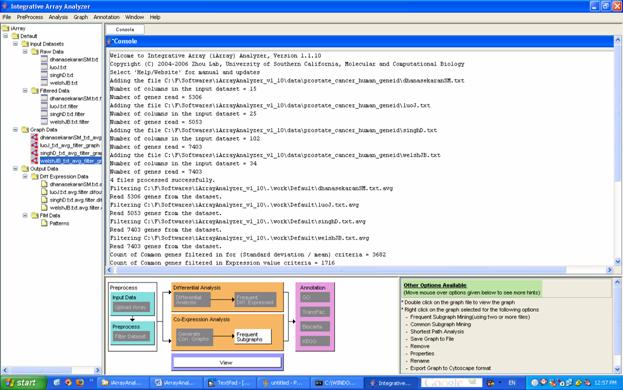
Figure 16: Graphs added in the navigation tree under [Default/Graph data]
In order to allow users to assimilate and explore the data and analyze results in an intuitive manner, we developed an interactive graph visualization module as an important part of iArray. This module provides various options to handle graph files, including generating graphs, visualizing graphs, intersecting graphs, and loading/saving graphs from or to external text files. Since the size of a graph generated from a microarray dataset is typically huge, it is recommended (sometimes forcefully) to view only a subgraph at any one time.
Bringing the mouse over the graph file in the navigation tree will display information about the graph. It contains the overall properties of the selected graph including the graph name, the minimum correlation used to generate this graph, the number of nodes, the number of edges, and the organism.
To view a correlation subgraph, first select a graph file from the navigation panel and click the ?View? button on the toolbar, or right-click on the file and select "View". A graph view dialog will appear (Figure 17). Select the input type (gene symbol or GeneID) and input one or more genes.
Alternatively, click the ?Choose? button, and a list of available nodes will appear from which one or more genes of interest can be selected. Next, set a minimum correlation (edges corresponding to correlations lower than this threshold will not be shown; a minimum correlation lower than that used to generate the graph will have no effect), and a radius (the distance in number of edges from the input gene or genes). Click the "OK" button, and the resulting subgraph will appear in the viewing panel (Figure 18).
For the running example, double click on dhanasekaranSM_txt_avg_filter_graph present under [Graph Data]. The dialog shown in Figure 17 appears.
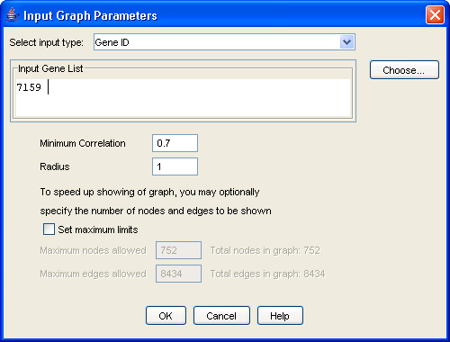
Figure 17: The graph view dialog
Either type the gene ID 7159 in the input gene list or click on the [Choose] button and then search for gene ID 7159 and select it. Then click on [OK]. The graph shown in Figure 18 will be displayed.
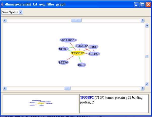
Figure 18: An example correlation graph.
You may find the global graph (bottom-left corner of the window) useful to go to any particular area of interest by just clicking on the corresponding area in the global graph. You can right-click on any node from the graph view panel to expand that node (i.e. find all adjacent nodes, which is helpful to mine for pathways), delete it, change its color and shape, or view various annotations of that gene in public databases. The green edges correspond to edges with negative correlation while the red edges correspond to those with positive correlation values. Double clicking on an edge displays the expression values of the related genes in the corresponding dataset as a line graph as shown in Figure 19.
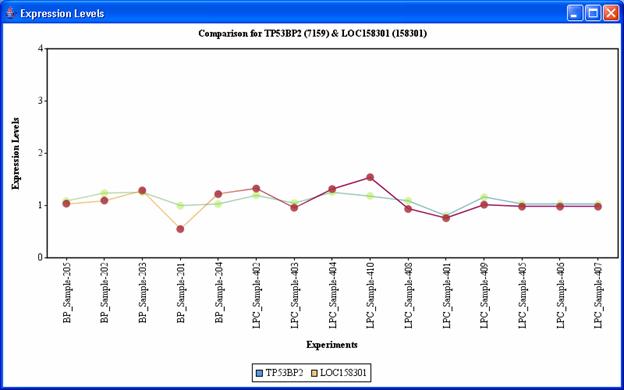
Figure 19: Expression levels displayed on double clicking on any edge.
To generate a graph intersection of multiple graphs, select menu [Analysis/Common Subgraph Mining]. This will generate a list of subgraphs occurring in all the selected graphs. The results will be placed under [Output Data/Frequent Subgraph Data].
iArray also allows users to load interaction graphs from external text files. The text file can be in any commonly delimited text format with three columns: the starting node, the ending node, and the correlation value. The order of the starting node and ending node is exchangeable, as the graph is undirected. To load an external graph, click [Graph/Load Graph] from the main menu and the load graph dialog window will appear. Find the graph data file, enter a description (optional), the organism and ID type of the nodes. Click "OK" to load the graph into the [Graph Data] section of the navigation tree.
iArray also allows you to export the graph either as an image or in cytoscape format. Choose the graph of interest and then choose either the [Export Graph Image to file] or [Export Graph to Cytoscape format] option in the Graph menu.
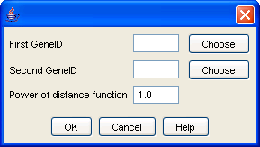
Figure 20: Shortest Path Analysis Dialog
If you want to find the relationship between two genes of your choosing, select a graph in the navigation tree and then click the [Shortest Path] button in the flowchart. This will show the shortest path in the network between the two genes (if they are at all connected ). This approach is useful to discover genes involved in your process of interest: if you know both genes are involved in the process being studied, then those stuck in between them are probably also involved. For details please refer to [11].
By modeling gene expression profiles as correlation graphs, we are able to mine interesting patterns in gene expression using graph-based algorithms. Various algorithms have been developed to discover interesting patterns for single graphs in the past decades. However, little attention has been paid to mining patterns across multiple graphs. One such interesting pattern is the frequent subgraph, which can identify clusters of genes that are connected in multiple graphs. This allows us to more confidently assign a biological role to that connectivity pattern, since it occurs in multiple independent datasets.
Once you?ve generated the graphs, select them all in the [Navigation Tree] and click on the [Frequent Subgraphs] button in the flowchart. The frequent subgraph dialog (Figure 21) appears. Select the graph files that you wish to mine and then select the minimum support (the minimum number of graphs on which the pattern should appear) and, optionally, check the [Find Dense Subgraphs] box to do just that. The biological justification for wanting to find dense subgraphs is simple enough: a subgraph is dense if all its nodes are highly interconnected, and this occurs if all the genes are highly co-regulated. This is an ideal starting point for annotation, as multiple lines of evidence point to all these genes being involved in the same process. As a measure of density, you can use one of two thresholds, or both combined: minimum cut, which is the minimum level of connectivity of any node to any other node in the subgraph, and minimum density, where density is defined as (2e)/(v(v ? 1)), that is, the number of edges divided by the total possible number of edges.
For the running example, select the four graph files, and then click on [Frequent subgraphs] in the flowchart. If you want to see any results in this case, change the minimum support (the minimum number of datasets in which this subgraph must appear to be considered frequent) to 3. You may also select the [Find dense subgraphs] option and leave the default values. Then click [OK]. The file FreqSub.gph will be added under [Output Data/Frequent Subgraph Data].
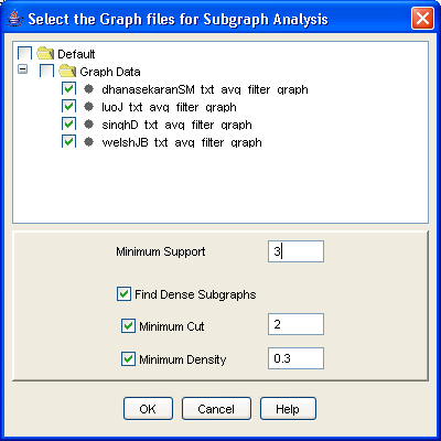
Figure 21: Frequent subgraph analysis dialog
Here you can find networks which occur in many different datasets ? and therefore, for which a lot of independent evidence exists. A nice starting point for biological discovery, don?t you think? You may also generate dense subgraphs after doing the Frequent subgraph mining. Double-clicking on the frequent subgraph result file will bring up the list of frequent subgraphs mined. To illustrate dense subgraph analysis, right-click on the file and select [Find dense subgraphs]. The dense subgraph dialog appears (Figure 23).
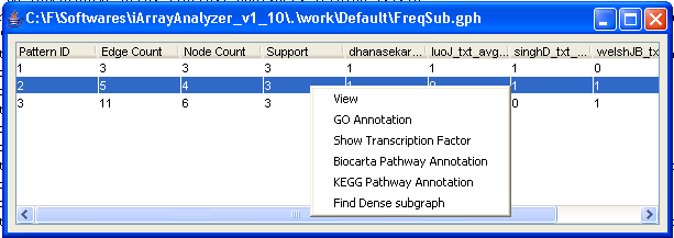 FFigure 22: Frequent subgraph results
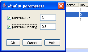
Figure 23: Find Dense Subgraph parameters
On clicking on View in the popup menu, the frequent subgraph will be displayed. Let us double click on the third subgraph. The graph in Figure 24 will be displayed.
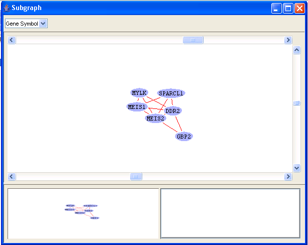
Figure 24: Frequent subgraph
Clicking on any of the edges will display the expression levels comparison in all the files in which the genes corresponding to the edge appears(Figure 25). You may need to readjust the size of the window to get a clear look at the comparisons.
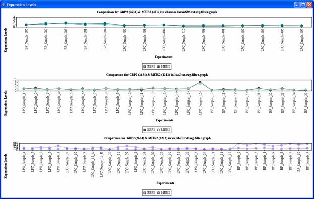
Figure 25: Frequent subgraph, expression level comparisons between MEIS2 and GBP2
If you want to squeeze just a little bit more juice out of our software, you have the annotation module to play with. The annotation module takes groups of genes as input and outputs some functions, pathways, and transcription factors? anything that?s overrepresented in your gene set. The Annotation module can only be used with graphs, FIM result files and frequent subgraph result files.
Gene Ontology (GO) annotation is implemented in iArray using the hypergeometric test. That is, for a given set of genes, we test whether the GO annotations of genes with known function are present in high proportion in a particular gene set. To avoid overly general GO categories, the analysis is restricted to GO nodes of level 4 or lower (the root of the gene ontology has level 0, and is the most general annotation possible; lower levels are progressively more specific). Finally, note that reported hypergeometric p-values may be corrected by specifying the type of correction in the [User options] (Section 8.1).
GO annotation can be performed on essentially any gene or set of genes within the iArray workspace. Right-click on a selected table entry (FIM and frequent subgraph files), a graph node or a set of nodes (graph files) and then click on [GO Annotation]. Alternatively, you may make your selection and click on the relevant annotation link in the flowchart.
For the running example, again double click on dhanasekaranSM_txt_avg_filter_graph and generate the graph for the Gene ID 7159 as in Section 6.3. Then select all the genes in the graph, right click and click on GO annotation. A list of annotations will appear (Figure 26).
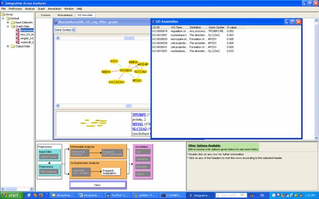
Figure 26: The result of GO annotation, here in the case of a graph node (see Section 6)
Using the Transfac database, we obtained experimentally validated protein-DNA interaction data in human (homo sapiens), and mouse (mus musculus). In addition, we created a potential transcription interaction database by scanning the transcription factor binding site weight matrices (again found in Transfac) in the 5kb upstream and 1kb downstream regions of all genes of human and mouse. All of this information was incorporated into iArray to predict potential common transcription regulators for frequent co-expression clusters or frequent differentially expressed gene sets.
As in GO annotation, transcription factors (both experimentally verified and computationally predicted) annotated in a particular gene set can be tested for overrepresentation by the hypergeometric test. A significant overrepresentation would be evidence that this transcription factor is involved in the biological process being studied.
As with GO annotation, to identify overrepresented transcription factors for a particular result (this is applicable to frequent subgraph analysis, frequent item mining and graphs), select a result, then right-click on the result and click on [TF Annotation] or click on the appropriate link from the flowchart. The TF annotation analysis result appears. The output segments are: transcription factor name, gene cluster, hypergeometric p-value, and evidence (P: putative, computational prediction; Exp: experimentally validated) (Figure 27).
For the running example, again double click on dhanasekaranSM_txt_avg_filter_graph and generate the graph for the gene ID 7159 as in Section 6.3. Then select all the genes in the graph, right click and click on TF annotation. The following results will be displayed.
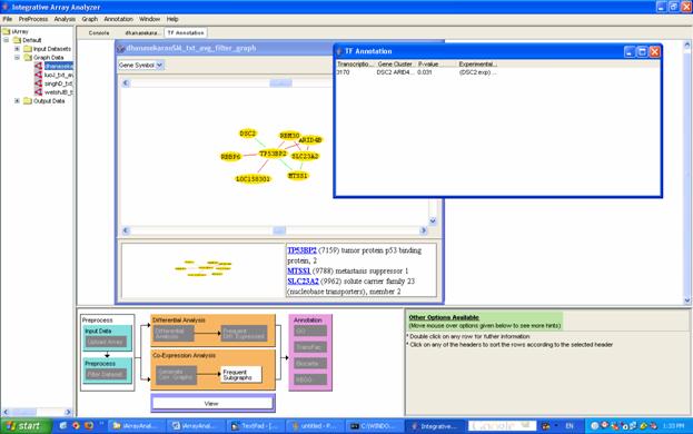
Figure 27: Result of TF annotation
The Biocarta and KEGG databases are a compilation of experimentally verified molecular pathways and networks, including protein-protein networks and protein-metabolite networks. The reliability of their annotations is in contrast to those found in many high-throughput databases. As with the GO and TF annotations, Biocarta and KEGG can be queried with virtually any gene or set of genes found by iArray's analysis modules.
To use Biocarta or KEGG, select a gene, gene list or graph node from iArray's Output, then right-click and select [Biocarta Pathway Annotation] or [KEGG Pathway Annotation], or click on the relevant annotation link in the flow chart. The result will be a list of annotations, along with the gene(s) that have received that annotation (Figure 28).
If you double-click on any annotated line, you will be taken on your web browser to the corresponding pathway of the Biocarta or KEGG database. Here, you can explore in more detail the biological role of the gene or genes that were mined by iArray's algorithms.
For the running example, again double click on dhanasekaranSM_txt_avg_filter_graph and generate the graph for the gene ID 7159 as explained before. Then select all the genes in the graph, right click and click on Biocarta annotation. The following results will be displayed.
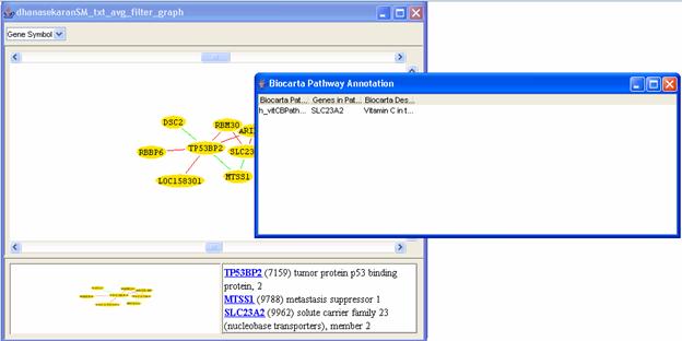
Figure 28: Result of Biocarta annotation
These modules will tell you whether the gene set you have found represents some known function ? and therefore allow you to move from meaningless lists of genes to biologically meaningful results. They can also help you to determine which processes to probe in future biological experiments.
iArray has a few other minor but important features which will help in the analysis
iArray has a set of user specified options that can be set to affect the outcome of the analysis done. The user options provided are:
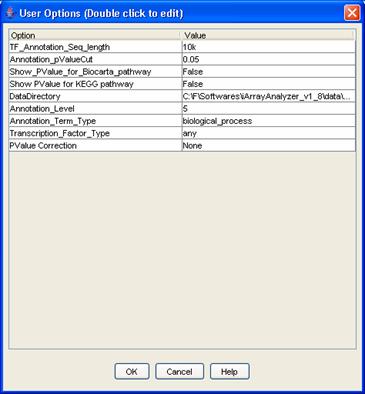
Figure 29: User options
This option can be used to search for a particular gene and its expression level across the data files. The option can be accessed using the [File/View Expression Level] menu option. You can enter one of GeneID, Gene Symbol, Unigene or probeset id to search for a gene. Select the relevant files in which to search for and then click on [OK] to view the results.
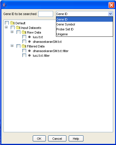
Figure 30: View Expression Level
1. Gentleman RC, Carey VJ, Bates DM, Bolstad B, Dettling M, Dudoit S, Ellis B, Gautier L, Ge Y, Gentry J, Hornik K, Hothorn T, Huber W, Iacus S, Irizarry R, Leisch F, Li C, Maechler M, Rossini AJ, Sawitzki G, Smith C, Smyth G, Tierney L, Yang JY, Zhang J (2004) Bioconductor: open software development for computational biology and bioinformatics. Genome Biol. 5(10):R80.
2. Cheng Li and Wing Hung Wong (2001) Model-based analysis of oligonucleotide arrays: Expression index computation and outlier detection, Proc. Natl. Acad. Sci. Vol. 98, 31-36
3. Dhanasekaran SM, Barrette TR, Ghosh D, Shah R, Varambally S, Kurachi K, Pienta KJ, Rubin MA, Chinnaiyan AM. (2001). "Delineation of prognostic biomarkers in prostate cancer." Nature 412(6849): 822-6.
4. Luo J, Duggan DJ, Chen Y, Sauvageot J, Ewing CM, Bittner ML, Trent JM, Isaacs WB. (2001). "Human prostate cancer and benign prostatic hyperplasia: molecular dissection by gene expression profiling." Cancer Res. 61: 4683-4688.
5. Welsh JB, Sapinoso LM, Su AI, Kern SG, Wang-Rodriguez J, Moskaluk CA, Frierson HF Jr, Hampton GM. (2001). "Analysis of gene expression identifies candidate markers and pharmacological targets in prostate cancer." Cancer Res 61: 5974-5978.
6. Singh D, Febbo PG, Ross K, Jackson DG, Manola J, Ladd C, Tamayo P, Renshaw AA, D'Amico AV, Richie JP, Lander ES, Loda M, Kantoff PW, Golub TR, Sellers WR. Gene expression correlates of clinical prostate cancer behavior.Cancer Cell. 2002 Mar;1(2):203-9.
7. Ellwood-Yen K, Graeber TG, Wongvipat J, Iruela-Arispe ML, Zhang J, Matusik R, Thomas GV, Sawyers CL. Myc-driven murine prostate cancer shares molecular features with human prostate tumors. Cancer Cell. 2003 Sep;4(3):223-38.
8. The Gene Ontology Consortium. Gene Ontology: Tool for the Unification of Biology. Nature Genetics, 25:25-29, 2000.
9. Xifeng Yan, X. Jasmine Zhou, Jiawei Han: Mining Closed Relational Graphs with Connectivity Constraints. ICDE 2005.
10. Grahne, G. & Zhu, J. High Performance Mining of Maximal Frequent Itemsets. Proceeding of the sixth SIAM International Workshop on High Performance Data Mining (2003).
11. Zhou, X., Kao, M.C. & Wong, W.H. Transitive functional annotation by shortest-path analysis of gene expression data. Proc Natl Acad Sci U S A 99, 12783-12788 (2002).
12. M. B. Eisen and P. T. Spellman, ?Cluster Analysis and Display of Genome Wide Expression Patterns,? Proceedings of the National Academy of Sciences USA , pp. 14863-14868, 1995.
13. Xianghong Jasmine Zhou, Ming-Chih J Kao, Haiyan Huang, Angela Wong, Juan Nunez-Iglesias, Michael Primig, Oscar M Aparicio, Caleb E Finch, Todd E Morgan & Wing Hung Wong, Functional annotation and network reconstruction through cross-platform integration of microarray data, Nature Biotechnology, 2005.
14. Homin K. Lee, Amy K. Hsu, Jon Sajdak, Jie Qin and Paul Pavlidis, Coexpression Analysis of Human Genes Across Many Microarray Datasets,Genome Research 14:1085-1094, 2004
15. Rakesh Agrawal, Ramakrishnan Srikant, Fast Algorithms for Mining Association Rules, Proc. 20th Int. Conf. Very Large Data Bases, VLDB, 1994.
16. G�sta Grahne and Jianfei Zhu, Efficiently Using Prefix-trees in Mining Frequent Itemsets, Proceeding of the First IEEE ICDM Workshop on Frequent Itemset Mining Implementations (FIMI'03), Melbourne, FL, Nov 2003.
17. Vaarala, M.H., Porvari, K., Kyllonen, A., Lukkarinen, O. and Vihko, P., 2001. The TMPRSS2 gene encoding transmembrane serine protease is overexpressed in a majority of prostate cancer patients: detection of mutated TMPRSS2 form in a case of aggressive disease. Int. J. Cancer 94, pp. 705?710.
18. Thomas, R., True, L.D., Bassuk, J.A., Lange, P.H. and Vessella, R.L., 2000. Differential expression of osteonectin/SPARC during human prostate cancer progression. Clin. Cancer Res. 6, pp. 1140?1149.
19. Kim, S.J., Uehara, H., Karashima, T., Shepherd, D.L., Killion, J.J. and Fidler, I.J., 2003. Blockade of epidermal growth factor receptor signaling in tumor cells and tumor-associated endothelial cells for therapy of androgen-independent human prostate cancer growing in the bone of nude mice. Clin. Cancer Res. 9, pp. 1200?1210.
20. Hu H, Yan X, Huang Y, Han J, Zhou XJ. Mining coherent dense subgraphs across massive biological networks for functional discovery. Bioinformatics. 2005 Jun 1;21 Suppl 1:i213-i221.